andra calligaro wins the 12th notte di fiaba illustration contest
Dear Illustrators,
the Jury of the 12th Edition of the Notte di Fiaba Illustration Contest gathered to evaluate the many works submitted on the theme Tarzan.
The overall level of the projects proved to be particularly high, with a widespread ability to interpret in a personal and contemporary way the relationship between humankind and nature, between instinct and imagination.
After careful consideration, we are pleased to announce the winners and special mentions of this edition.
The Jury would like to thank all participants for the high quality of the submitted projects. This edition confirms how children’s illustration today represents a fertile ground for research and experimentation, capable of combining technique, imagination and narrative depth into ever new and personal visual languages.
1st prize
andra calligaro
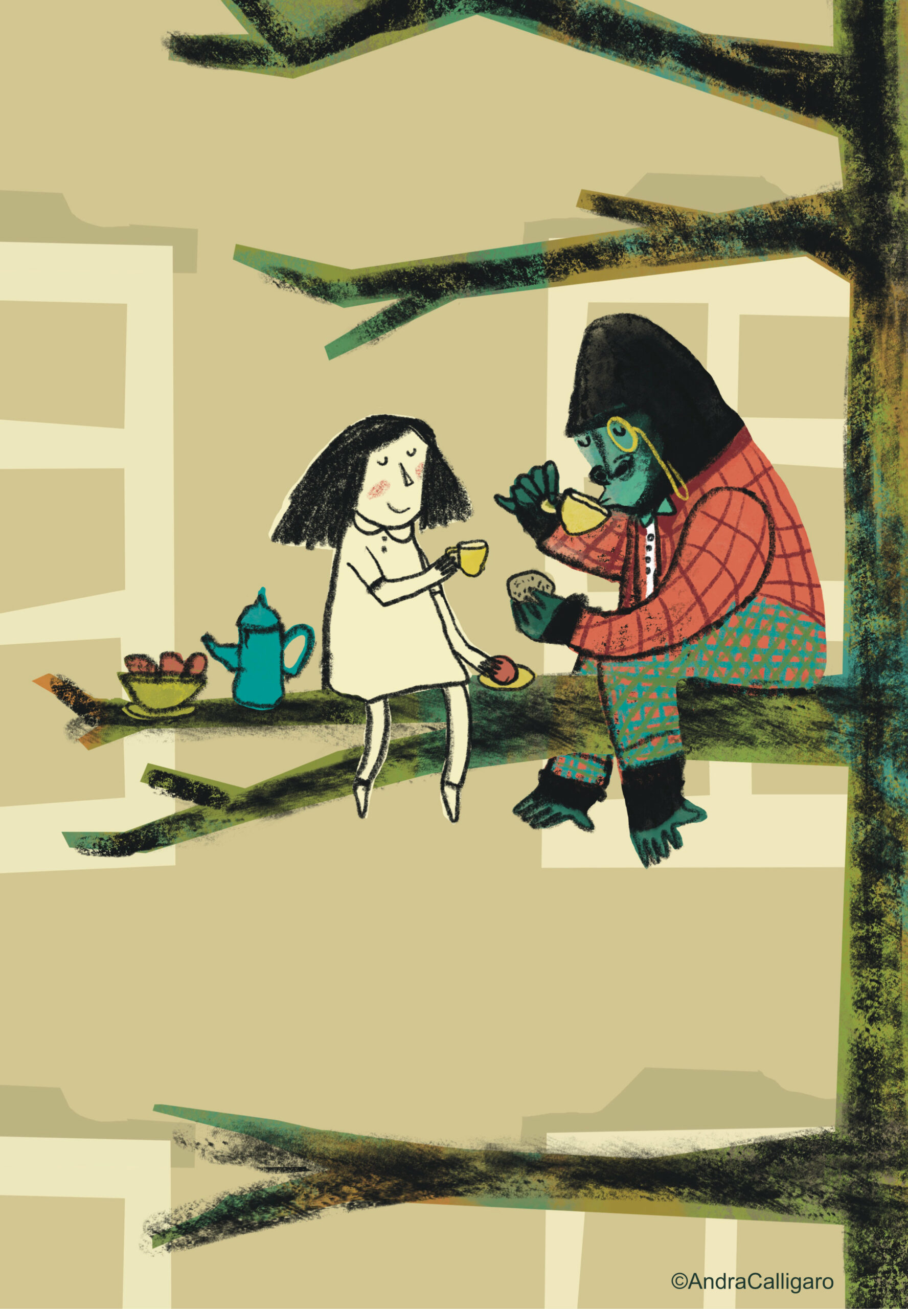
As already demonstrated in the previous edition, Andra Calligaro confirms an extraordinary maturity in conceiving the illustrated book as a complete, coherent and fully resolved organism.
The project stands out for its balance and restraint in the use of space and color, as well as for the refined integration of digital languages—charcoal and collage—reinterpreted in a personal way, overcoming any technical rigidity.
The result is a warm, immersive and highly engaging visual universe, capable of moving the reader and guiding them through a fluid and continuous narrative.
The strength of the work lies in a full awareness of the book as a medium: each spread dialogues with the next in a perfectly calibrated rhythm, demonstrating a rare mastery in the field of children’s illustration.
A project of great quality, confirming a solid, recognizable and already fully mature talent.
2nd prize
Piero Sandano
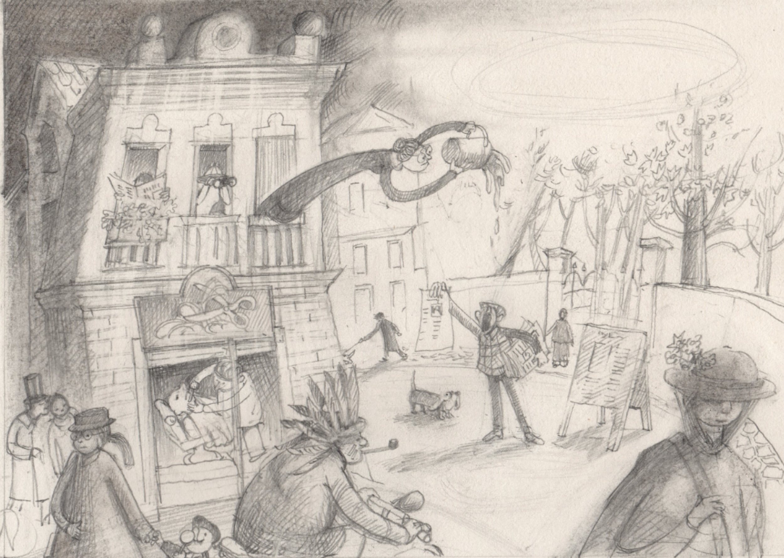
Piero Sandano’s work stands out for the extraordinary quality of his drawing and for a very high level of technical mastery, evident in the handling of perspective, architecture and anatomy.
The storyboard distinguishes itself through a rich and articulated narrative construction, capable of intertwining the main story with a multitude of micro-narratives that populate the spreads with great sensitivity and compositional intelligence.
The directorial choices, often bold and surprising—as seen in the final spread—bring rhythm and dynamism to the story, while the conscious use of black and white enhances the expressive strength of the line and the depth of chiaroscuro.
The project successfully conveys the world of Tarzan with irony and delicacy, building a dense, engaging and visually compelling narrative.
For a further qualitative leap, it is essential that the transition to color and final illustrations does not compromise the strength of the line. It is recommended to work with a more controlled palette and a management of chiaroscuro consistent with the storyboard, avoiding flattening effects and loss of depth caused by digital treatment, which currently disrupts the beautiful atmospheres achieved in the storyboard.
3rd prize
Marianna Romani
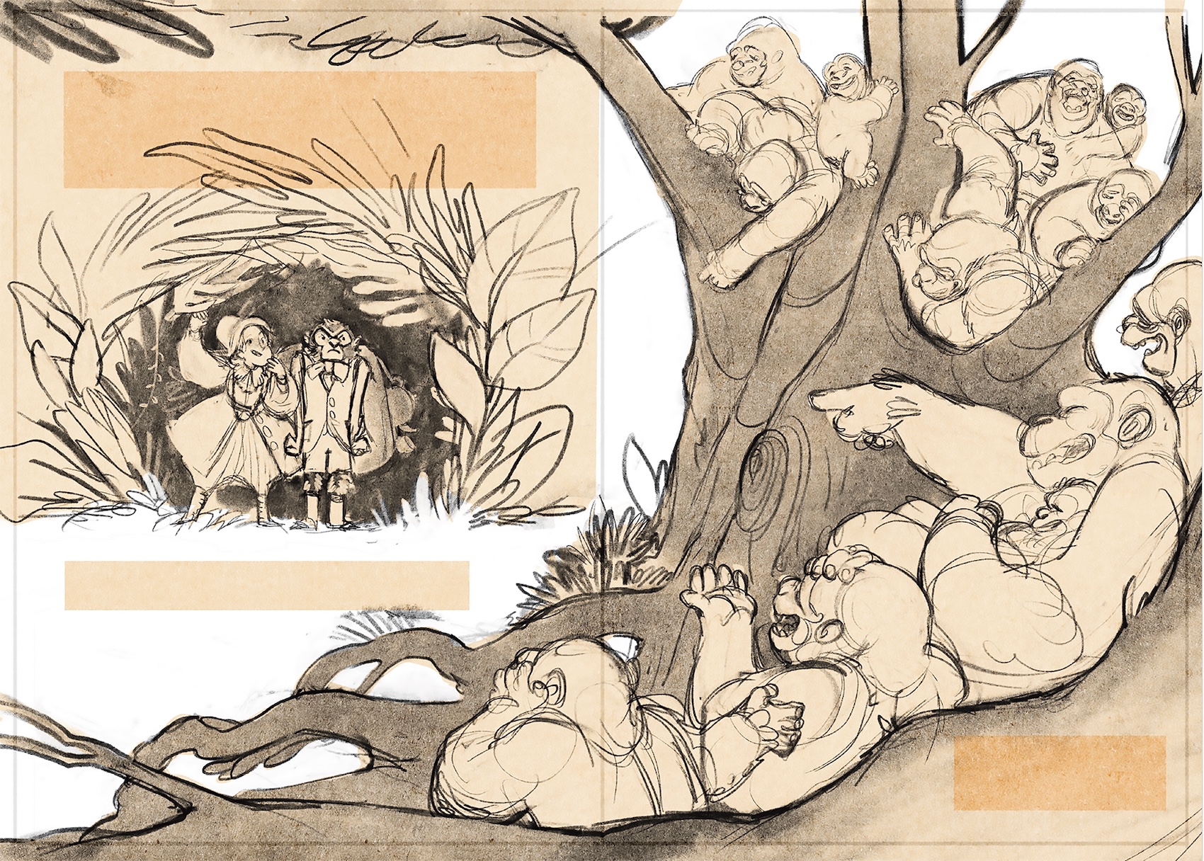
Marianna Romani presents a storyboard of great richness and complexity, capable of sustaining an articulated and deeply immersive narrative.
The drawing reveals a solid knowledge of anatomy and proportions, allowing her to construct both human and animal characters with natural ease, placed within dynamic and always credible compositions.
The spreads are infused with a strong sense of movement and a remarkable attention to detail, elements that expand the narrative potential of the text and stimulate the reader’s imagination.
A generous and energetic work that demonstrates notable design ability and a broad, structured narrative vision.
To strengthen the overall effectiveness of the project, it is important to preserve in the final illustrations the spontaneity, softness and warmth of the line present in the storyboard, avoiding an overly rigid and academic rendering that unfortunately dulls its expressive identity.
“Livio Sossi – Emerging Talents” Award
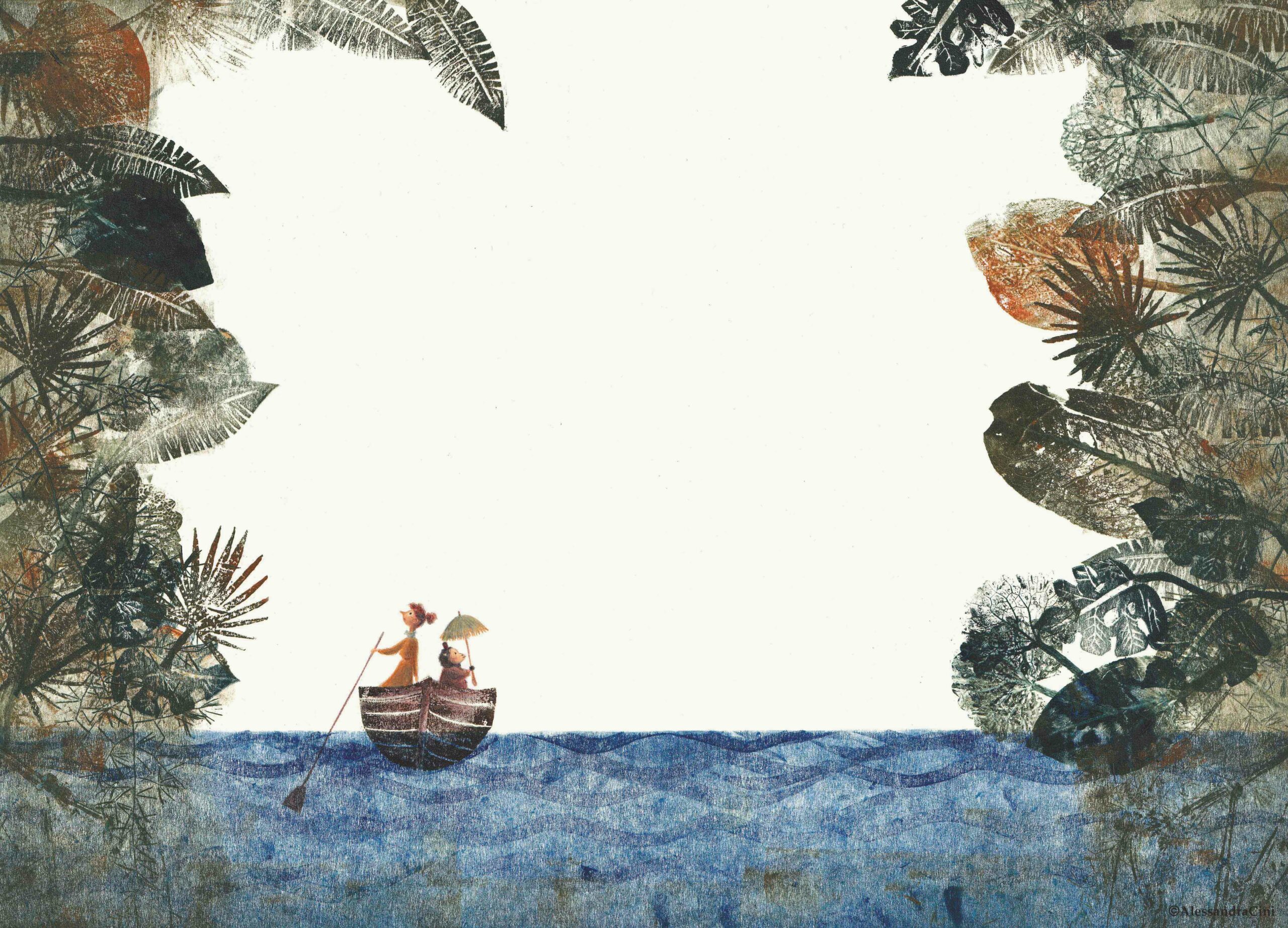
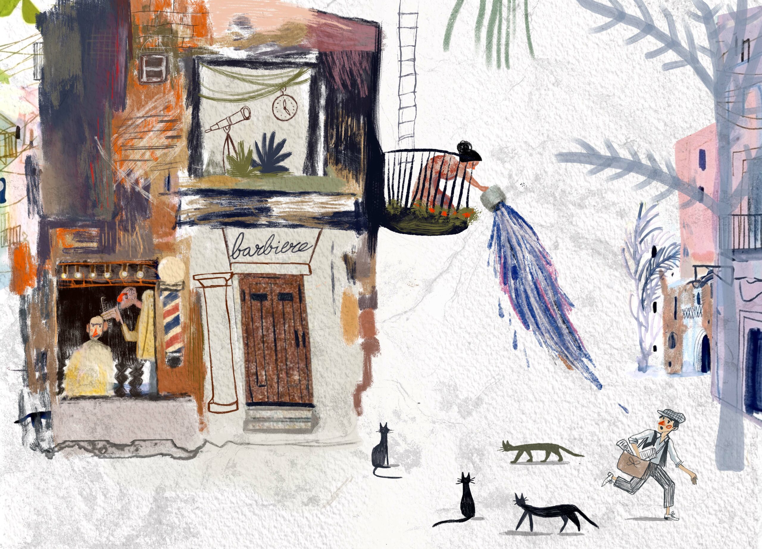
Alessandra Cini
Alessandra Cini stands out for an experimental and material-driven approach of great interest, capable of combining traditional techniques such as monotype, printmaking and colored pencils into a suggestive and articulated visual language.
Both urban and natural environments are constructed with sensitivity and attention to space, contributing to the creation of evocative and layered atmospheres.
The storyboard is well-paced and carefully orchestrated, with an intelligent use of filled and empty spaces that invites the reader to actively participate in the narrative, completing with their own imagination what is only suggested.
A project that distinguishes itself for its research, sensitivity and desire to explore the language of illustration.
To make the work fully resolved, it is necessary to further develop the stylistic coherence of the characters, building a visual language that interacts more harmoniously with the quality and poetic strength of the environments.
Special Mentions
Aurora Cavaleri
For her ability to create highly impactful spreads, rich in atmosphere and chromatic sensitivity. The storyboard stands out for the quality of its images—suggestive and poetic—which reveal strong drawing skills and color management.
For greater overall effectiveness, it is essential to work on stylistic continuity across the spreads, avoiding inconsistencies that weaken the perception of the book as a unified whole.
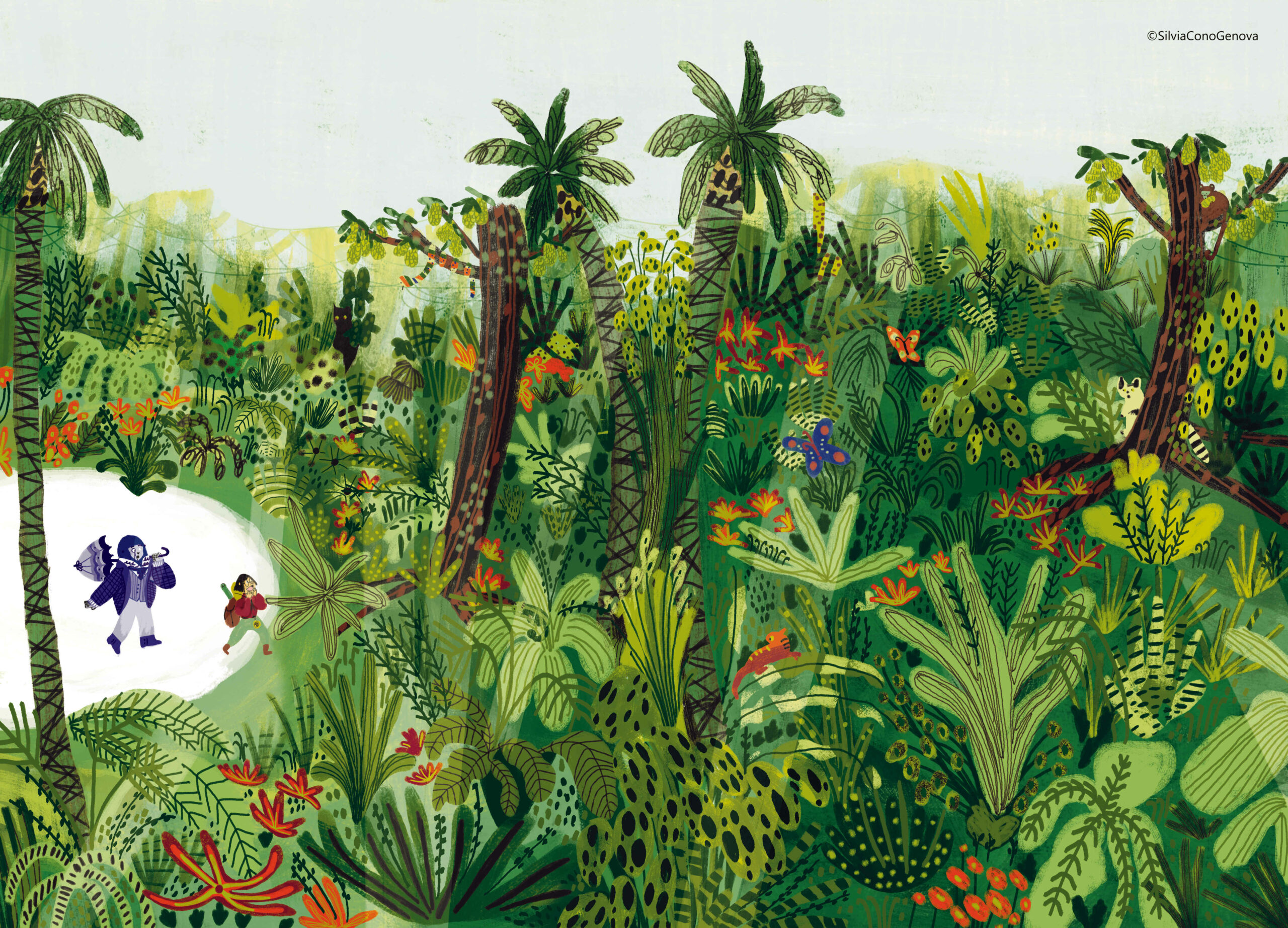
Silvia Cono Genova
For her interesting chromatic research and use of unconventional palettes, handled with courage and personality. The project shows a good ability to construct rhythm and space, enriched by fresh and intelligent narrative ideas.
For further development, it is necessary to deepen the logic of the double-page spread, designing compositions as integrated visual units rather than as juxtaposed single images.
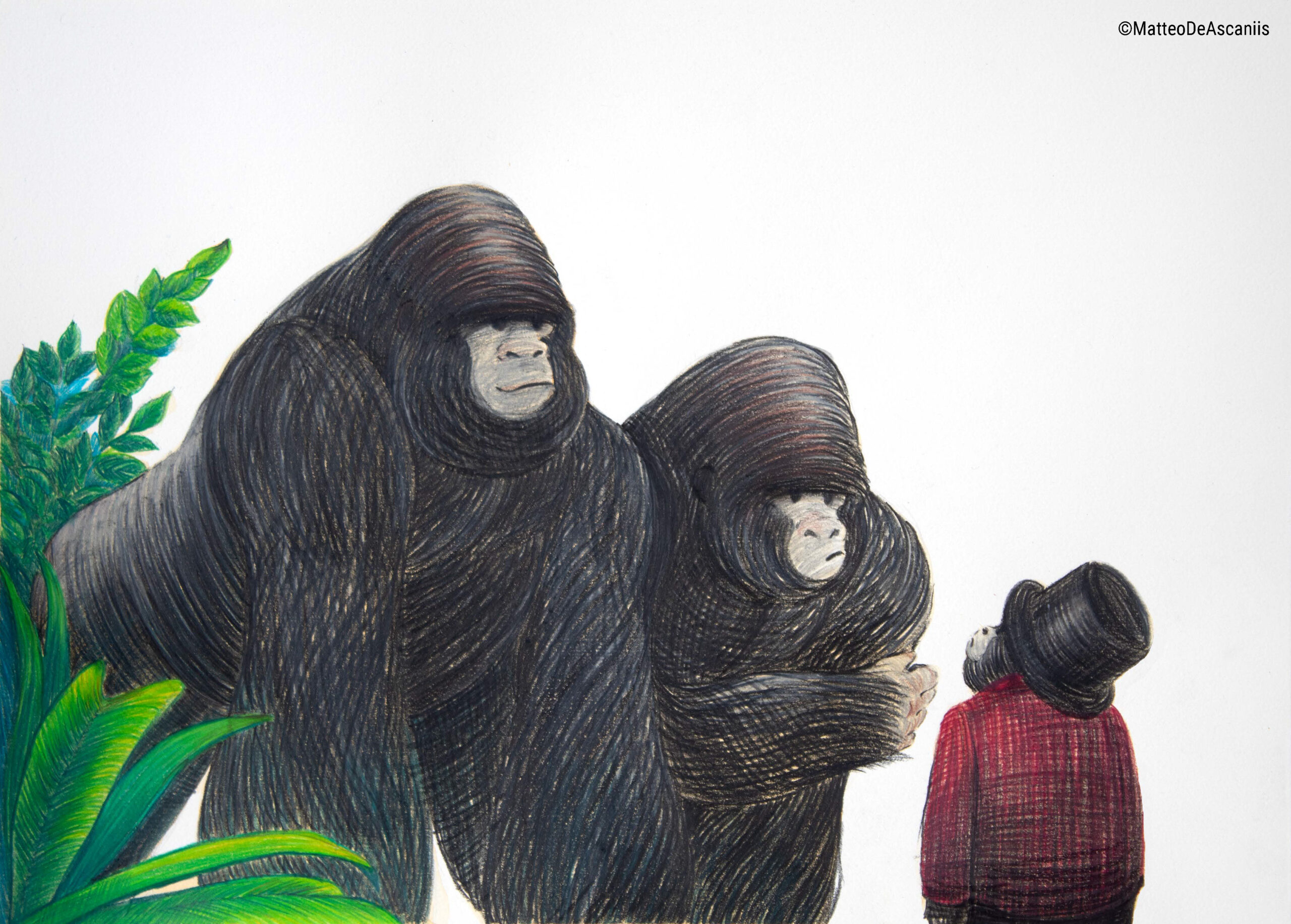
Matteo De Ascaniis
For the clarity and coherence of the storyboard, supported by a conscious use of white space that enhances both characters and environments. The line, solid and controlled, demonstrates strong technical competence and narrative awareness.
To evolve his visual language, it is important to distance himself from recognizable stylistic references and pursue a more personal research of the line, making it immediately identifiable—as it was in his work presented for the Pocahontas edition.
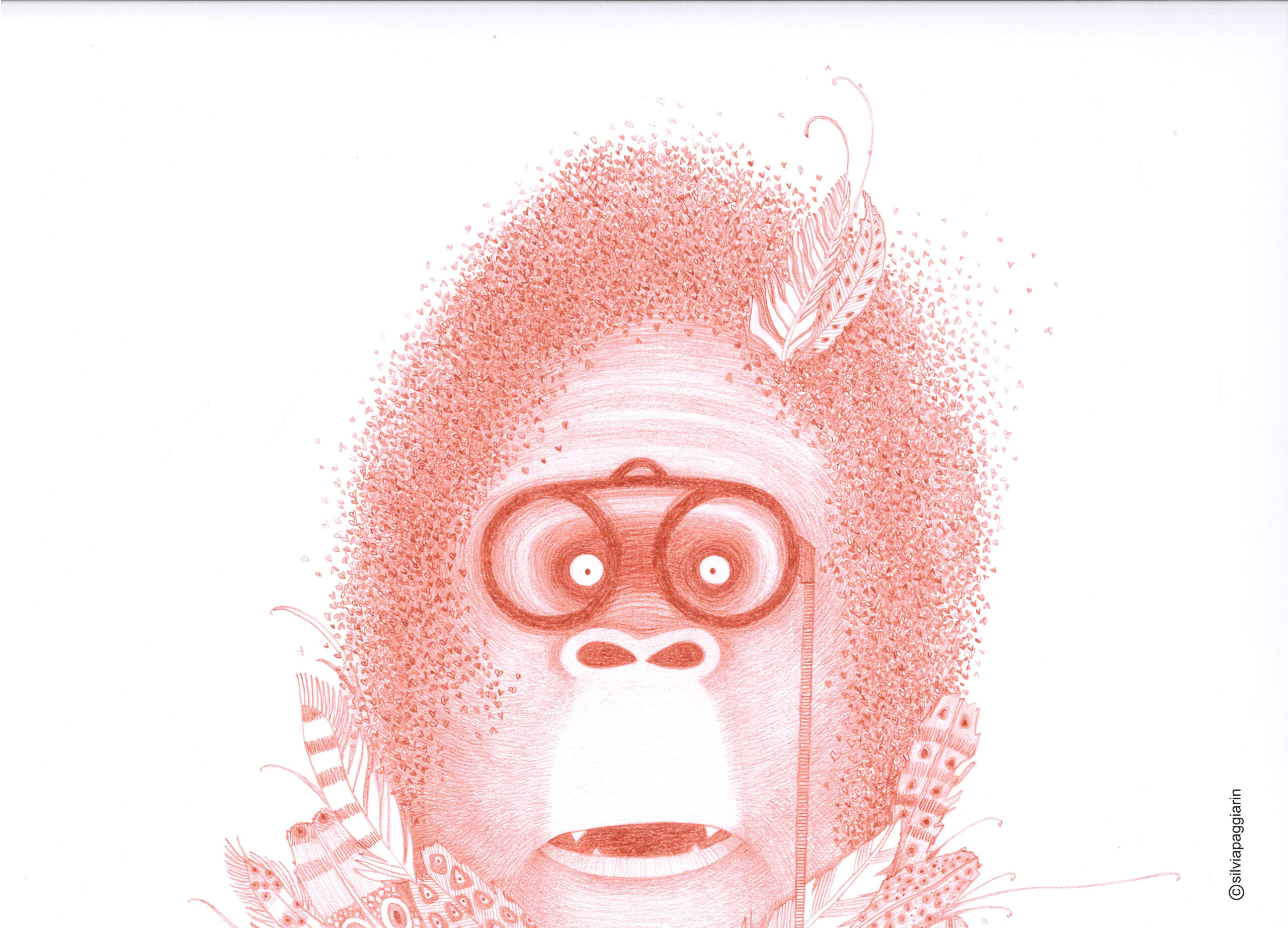
Silvia Paggiarin
For her poetic and evocative visual language, capable of building a narrative also through what is left unsaid. The use of space and perspective contributes to a delicate, open and highly imaginative and symbolic visual storytelling.
However, to amplify the impact of the images, it is recommended to explore a broader chromatic range, capable of supporting and enhancing the richness of the narrative already present.
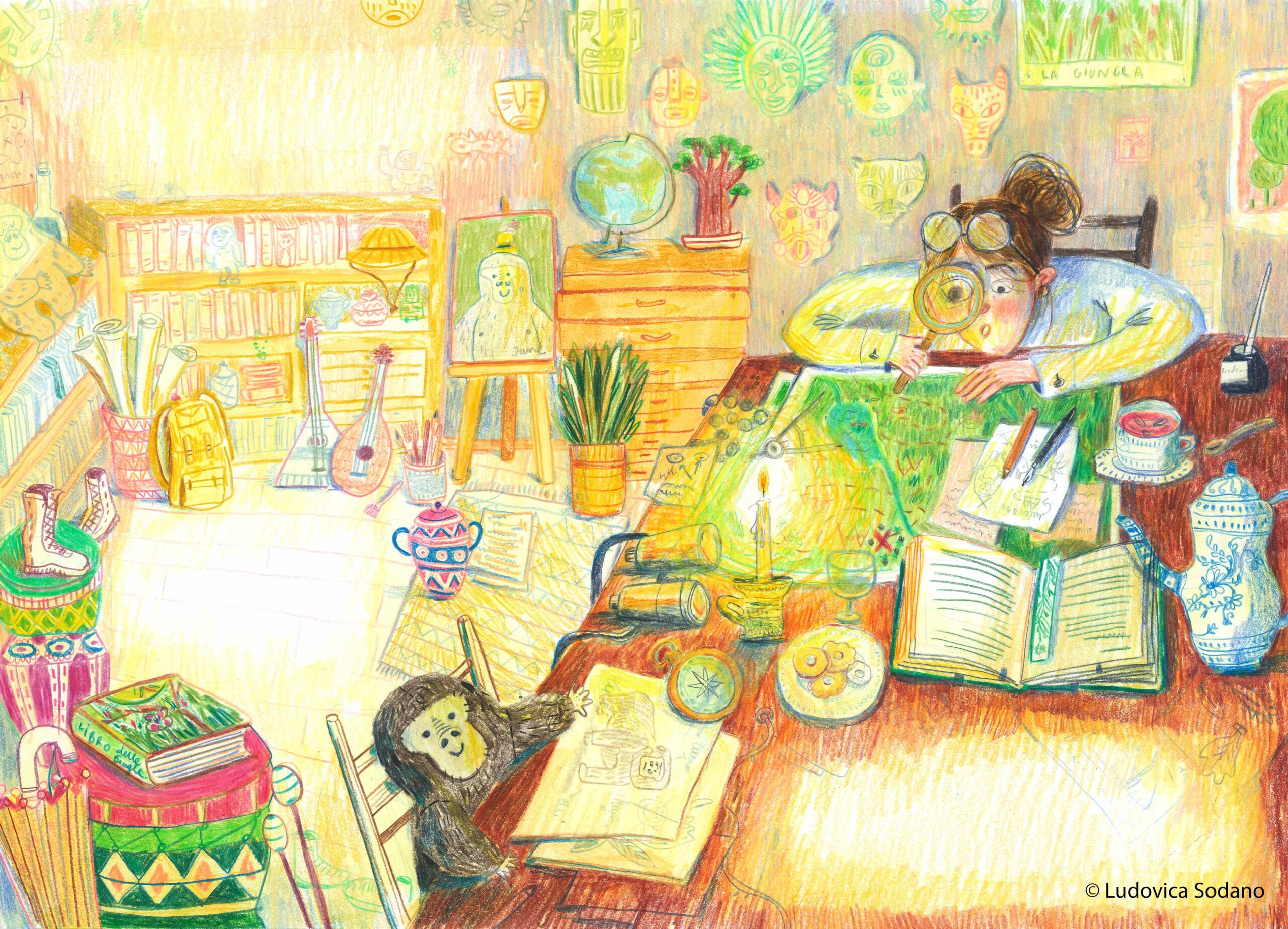
Ludovica Sodano
For her narrative energy and the richness of visual ideas, which make the storyboard lively, ironic and engaging. The project stands out for its ability to construct a dynamic story filled with details that stimulate the imagination of young readers.
To improve visual readability, it is important to work on a clearer hierarchy of elements, through a more controlled use of color and light that guides the viewer’s eye.
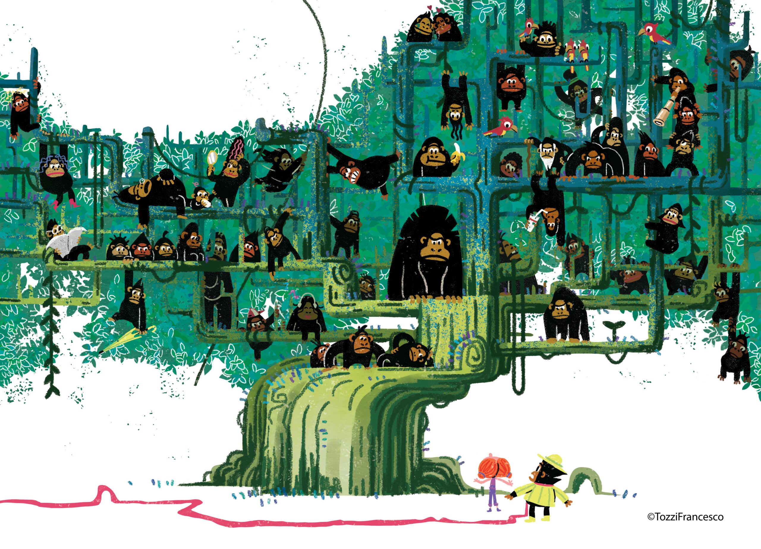
Francesco Tozzi
For an original and recognizable style that engages with pixel art aesthetics and the visual language of 1980s video games. The project stands out for rhythm, dynamism and several brilliant and unexpected narrative solutions. The tree scene recalls Donkey Kong and Pac-Man and is rich with playful and ironic narrative cues.
To strengthen the project, it is necessary to work on the consistency of execution across the spreads, avoiding uneven quality that compromises the coherence of the narrative.
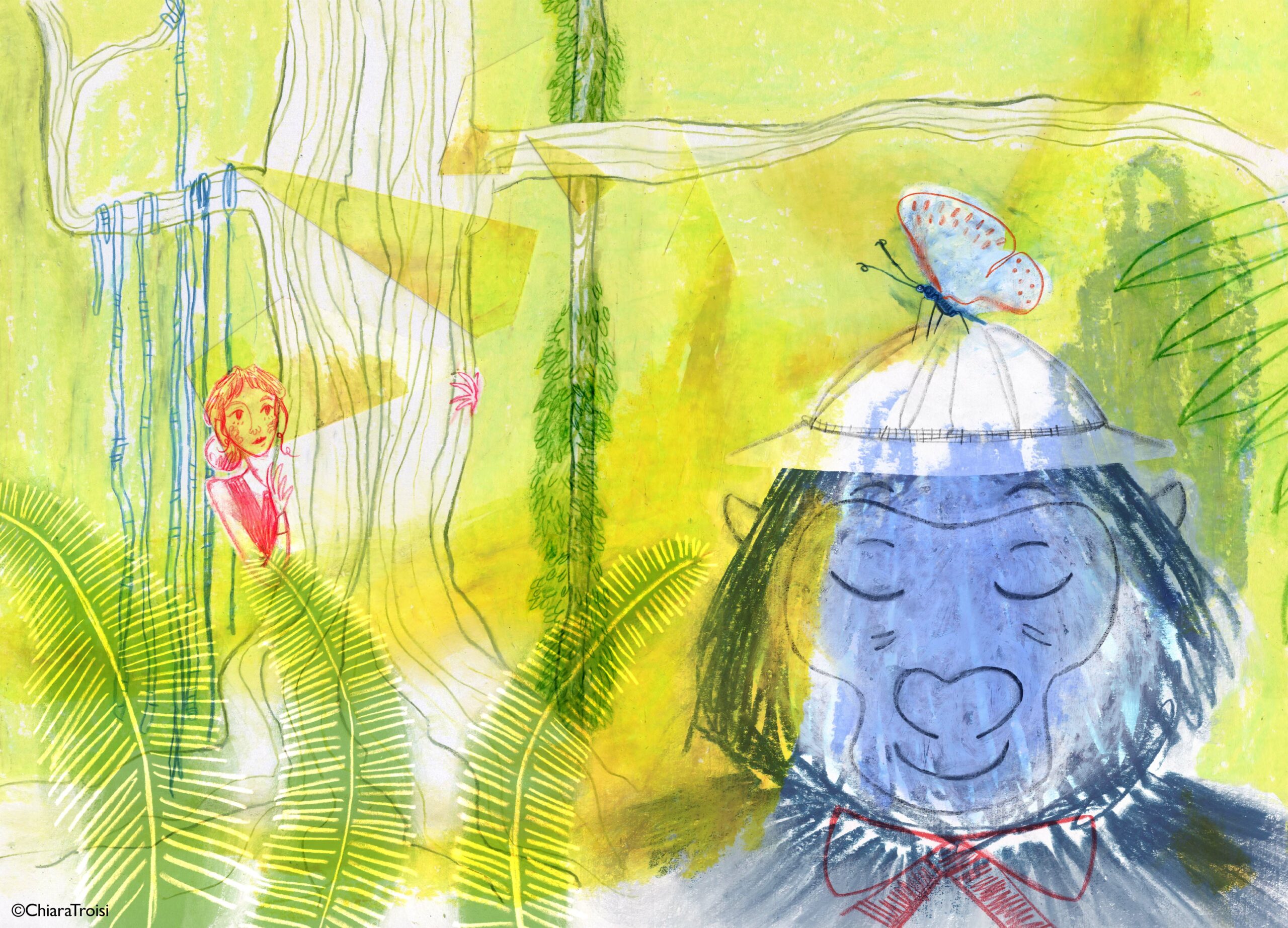
Chiara Troisi
For the strong personality of her line and the bold use of color, which contributes to building a vivid and immediate visual narrative. The storyboard stands out for the presence of interesting narrative solutions and a clear graphic identity.
For a more mature development of the project, it is important to deepen the characterization of the characters, moving beyond more stereotypical solutions drawn from animation (e.g. Jane’s eyes) toward greater expressive complexity.